01: How I edit for skin tones in Lightroom

Disclaimer
There’s so much that can be said about editing.
I’ll start by emphasizing that editing is subjective! Like so much in photography is. If you dig the way the skin tones in our photos look, this blog will give you some insight into my thought process and techniques (I edit all of our photos). If not, hey, glad you’re here anyhow.
There really is no one right or correct way to do it. I think there are a lot of ways to do it well, and a bunch of ways to do it poorly. When you’re learning (and we’re all always learning), get a second and third and tenth opinion. Here’s just one.
Goals
I’ve got two goals in editing wedding photos: one, fit the general editing vibe I’m after. And two, flatter the skin tones. Emphasis on flattery, not getting the “correct” skin tones. Working toward technically-correct skin tones can lead to boring or unflattering photos. Busting out a white/gray card or color checker is great in product photos, but does not always lead to the most flattering or vibe-fitting results when photographing people.
Some people hang their hat on technical correctness. I do not.
What I aim for
So much is determined at the time you push the shutter button, so I always “shoot for the edit.” Editing is really only fun when you start with a photo with good light to begin with. When possible, choose your positioning and pose accordingly to give yourself the best starting point possible once you’re back at the computer.
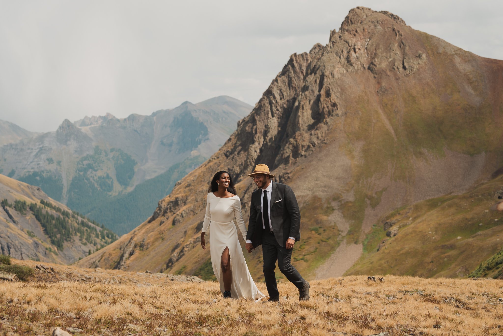
In the edit, I’m aiming for a generally soft (contrast) and warm (temperature) vibe.
For contrast: I’m looking for a flattering relationship between the lit and shaded parts of a person’s face — even in direct light (which I love). I don’t want the bright spots to be super bright/blown out, nor entirely dark. Again you might, but I’m going for something a little softer.
Technically, skin tones tend to occupy the middle tones of an image (the middle range between very bright and very dark) and I don’t like to have a lot of contrast within this range. It tends to look crunchy, especially in close-ups. I avoid using the clarity slider (at least in these parts of the image) for this reason — used globally, it adds contrast in the mid tones (the skin tones). I don’t prefer the look, but hey you might! Same is true with the texture panel. Can be fine for wider shots, but adding texture to closeups is generally not flattering (though there are specific uses of course where I think this works).
For temperature: I’m aiming for the cool side of warm. I don’t want blueish sickly skin, and I don’t want overly orange fake golden hour — unless it was actually like that, and even then I evoke that warmth without going overboard. While I don’t follow it strictly, I do check the warmth technically using this method:
Grab the white balance dropper (W) and hover over the brightest part of someone’s upper cheek and then look at the RGB values under the histogram in the right-most panel of the edit module.
Red should be the highest number, green second highest, and blue the lowest.
Ideally the gap between the blue and green values is roughly the same as the gap between green and red. This gap should be more than 5 (to keep them from being too gray).
Taking the general vibe into account, I’ll edit WB until it’s too warm, and back it down until it feels about right. Then I’ll check the values to make sure I’m not wildly off the mark.
Blue values higher than green? Add warmth (yellow).
Gap between values not at least 5? Needs more saturation, either through the saturation slider, preferably the vibrance slider, or a result of using the contrast slider (which increases saturation). Can also so be achieved in the tone curve, but that’s beyond the scope of an intro article.
Dark skin tones & Presets
Worth noting that my WB adjustments are global (affect the whole image) as part of my custom editing preset. In rare instances I’ll do some selective WB adjustments using a brush layer, but the effect looks weird very quickly. Use sparingly.
Crucial: when you’re designing your preset (and you should absolutely use a preset in your workflow eventually) — make sure it works for dark skin tones.
That means really considering the ways your preset (or use of the HSL/color grading panel) are changing the red, orange, and yellow channels. Pushed too far, or without consideration, some adjustments look awful for dark skin tones, being neither correct nor flattering. Dark skin tones follow the same rules and suggestions as light skin — look back at the RGB value method above — they’re just darker. Don’t make them go to gray, and don’t make dark skin tones not-dark.
Film processes and now camera sensors have already been designed and tuned for light skin. If you care to work with people of color, act accordingly in your edits. It’s really not that tricky!
A note on cinema
Onto a bit of a tangent here: I love movies. I’m constantly looking to movies for inspiration on examples of color grading (editing) that I find interesting.
Thing is, stills from a movie don’t need to stand on their own as they’re not viewed that way. If a scene takes place at dusk for instance, it’s common to see skin tones take on the more “correct” “naturalized” blue hue, or in heavy shadow. When a photo takes place at dusk, I don’t generally let them dip as far blue; I want each image to stand on its own to a degree and be consistent with the set, and though a strong tint could make perfect sense in the film’s context, I don’t think it does for a still frame.
So I’ll go on the cool side of warm but seldomly cool. I’ll go on the darker side, but not super heavily-shadowed. At least for general wedding photography! In other kinds of portraiture with more flexibility or a more editorial look, I love it.
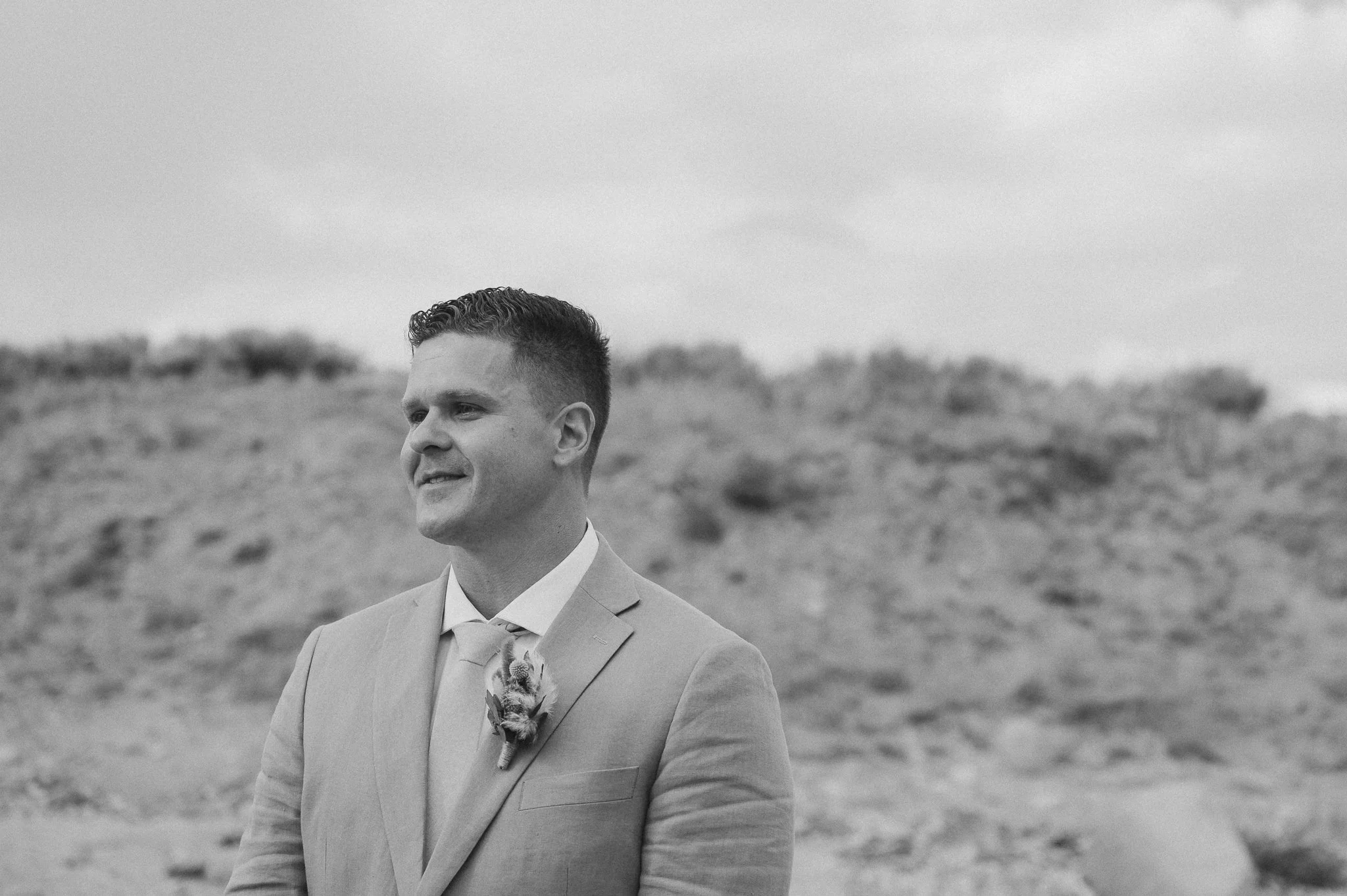
Fuck it, try b&W
Last tip: if a photo is particularly challenging to nail the skin tone, consider making it black and white. Mixing multiple color temperatures indoors? Wicked-heavy backlight and flare? Intense green color cast from foliage? Sometimes the light is just too damn weird. What a great reason to try the photo in B&W.
If it still doesn’t work in B&W, the shot probably needs to be tossed.
-Austin